


猫头鹰组件
Odoo Javascript 框架使用名为 Owl 的自定义组件框架。它是一个声明式组件系统,大致受到 Vue 和 React 的启发。组件使用 QWeb templates 定义,并用一些 Owl 特定指令进行丰富。官方 Owl documentation 包含完整的参考资料和教程。
重要
虽然代码可以在 web 模块中找到,但它是从单独的 GitHub 存储库维护的。因此,对 Owl 的任何修改都应通过 https://github.com/odoo/owl 上的拉取请求进行。
注解
目前,所有 Odoo 版本(从版本 14 开始)共享相同的 Owl 版本。
使用 Owl 组件
Owl documentation 已经详细记录了 Owl 框架,因此此页面将仅提供 Odoo 特定信息。但首先,让我们看看如何在 Odoo 中制作一个简单的组件。
import { Component, xml, useState } from "@odoo/owl";

class MyComponent extends Component {
    static template = xml`
        <div t-on-click="increment">
            <t t-esc="state.value">
        </div>
    `;

    setup() {
        this.state = useState({ value: 1 });
    }

    increment() {
        this.state.value++;
    }
}
此示例表明 Owl 可作为全局命名空间中的库使用(如 owl):它可以像 Odoo 中的大多数库一样使用。请注意,我们在这里将模板定义为静态属性,但没有使用 static 关键字,该关键字在某些浏览器中不可用(Odoo javascript 代码应符合 Ecmascript 2019 兼容)。
我们在 xml 帮助器的帮助下在 javascript 代码中定义模板。然而,它仅对入门有用。实际上,Odoo 中的模板应该在 xml 文件中定义,以便可以翻译它们。在这种情况下,组件应该只定义模板名称。
实际上,大多数组件应该定义 2 或 3 个文件,位于同一位置:一个 javascript 文件 (my_component.js)、一个模板文件 (my_component.xml) 和一个可选的 scss(或 css)文件 (my_component.scss)。然后应将这些文件添加到某些资产包中。 Web 框架将负责加载 javascript/css 文件,并将模板加载到 Owl 中。
以下是上述组件的定义方式:
import { Component, useState } from "@odoo/owl";

class MyComponent extends Component {
    static template = 'myaddon.MyComponent';

    ...
}
现在模板位于相应的 xml 文件中:
<?xml version="1.0" encoding="UTF-8" ?>
<templates xml:space="preserve">

<t t-name="myaddon.MyComponent">
  <div t-on-click="increment">
    <t t-esc="state.value"/>
  </div>
</t>

</templates>
注解
模板名称应遵循 addon_name.ComponentName 约定。
其他资料
最佳实践
首先,组件是类,因此它们有一个构造函数。但构造函数是 javascript 中的特殊方法,不能以任何方式重写。由于这是 Odoo 中偶尔有用的模式,因此我们需要确保 Odoo 中没有组件直接使用构造函数方法。相反,组件应该使用 setup 方法:
// correct:
class MyComponent extends Component {
    setup() {
        // initialize component here
    }
}

// incorrect. Do not do that!
class IncorrectComponent extends Component {
    constructor(parent, props) {
        // initialize component here
    }
}
另一个好的做法是对模板名称使用一致的约定:addon_name.ComponentName。这可以防止 odoo 插件之间的名称冲突。
参考文献列表
Odoo Web 客户端是使用 Owl 组件构建的。为了使其更容易,Odoo javascript 框架提供了一套通用组件,可以在某些常见情况下重用,例如下拉列表、复选框或日期选择器。本页说明如何使用这些通用组件。
技术名称 |
简短描述 |
|---|---|
一个滑动组件,用于在触摸滑动时执行操作 |
|
一个简单的复选框组件,旁边有一个标签 |
|
可供选择的颜色列表 |
|
全功能下拉菜单 |
|
使用选项卡在页面之间导航的组件 |
|
一个处理分页的小组件 |
|
用于在不同选项之间进行选择的下拉组件 |
|
以圆形药丸形式显示的标签列表 |
动作滑动器
地点
@web/core/action_swiper/action_swiper
描述
这是一个可以在水平滑动元素时执行操作的组件。滑动器正在包装目标元素以向其添加操作。一旦用户释放滑动器超过其宽度的一部分,就会执行该操作。
<ActionSwiper onLeftSwipe="Object" onRightSwipe="Object">
  <SomeElement/>
</ActionSwiper>
使用该组件的最简单方法是直接在 xml 模板中的目标元素周围使用它,如上所示。但有时,您可能想要扩展现有元素并且不想复制模板。这样做是可能的。
如果要扩展现有元素的行为,则必须通过直接包装该元素来将其放置在其中。此外,您还可以有条件地添加属性来管理元素何时可滑动、其动画以及执行操作所需滑动的最小部分。
您可以使用该组件轻松地与记录、消息、列表中的项目等进行交互。
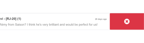
以下示例创建一个基本的 ActionSwiper 组件。此处,可以在两个方向上滑动。
<ActionSwiper
  onRightSwipe="
    {
      action: '() => Delete item',
      icon: 'fa-delete',
      bgColor: 'bg-danger',
    }"
  onLeftSwipe="
    {
      action: '() => Star item',
      icon: 'fa-star',
      bgColor: 'bg-warning',
    }"
>
  <div>
    Swipable item
  </div>
</ActionSwiper>
注解
使用从右到左 (RTL) 语言时,操作会被排列。
道具
姓名 |
类型 |
描述 |
|---|---|---|
|
|
可选布尔值,用于确定滑动期间是否存在平移效果 |
|
|
滑动结束后使用的可选动画( |
|
|
如果存在,则 actionswiper 可以向左滑动 |
|
|
如果存在,则 actionswiper 可以向右滑动 |
|
|
必须滑动才能执行操作的可选最小宽度比 |
您可以同时使用 onLeftSwipe 和 onRightSwipe 道具。
用于左/右滑动的 Object 必须包含:
action,这是用作回调的可调用Function。一旦在给定方向上完成滑动,就会执行该操作。
icon是要使用的图标类,通常表示操作。它必须是string。
bgColor是背景颜色,用于装饰动作。可以是以下 bootstrap contextual color (danger、info、secondary、success或warning)之一。必须给出这些值来定义滑动器的行为和视觉效果。
示例:扩展现有组件
在以下示例中,您可以使用 xpath 来包装 ActionSwiper 组件中的现有元素。此处添加了滑动器以将消息标记为在邮件中已读。
<xpath expr="//*[hasclass('o_Message')]" position="after">
  <ActionSwiper
    onRightSwipe="messaging.device.isMobile and messageView.message.isNeedaction ?
      {
        action: () => messageView.message.markAsRead(),
        icon: 'fa-check-circle',
        bgColor: 'bg-success',
      } : undefined"
  />
</xpath>
<xpath expr="//ActionSwiper" position="inside">
  <xpath expr="//*[hasclass('o_Message')]" position="move"/>
</xpath>
复选框
地点
@web/core/checkbox/checkbox
描述
这是一个简单的复选框组件,旁边有一个标签。该复选框链接到标签:只要单击标签,就会切换该复选框。
<CheckBox value="boolean" disabled="boolean" t-on-change="onValueChange">
  Some Text
</CheckBox>
道具
姓名 |
类型 |
描述 |
|---|---|---|
|
|
如果为 true,则选中该复选框,否则取消选中 |
|
|
如果为 true,则禁用该复选框,否则启用该复选框 |
颜色表
地点
@web/core/colorlist/colorlist
描述
ColorList 允许您从预定义列表中选择颜色。默认情况下,该组件显示当前选定的颜色,并且在 canToggle 属性出现之前无法展开。不同的道具可以更改其行为,以始终展开列表,或使其在单击后充当切换器,以显示可用颜色列表,直到选择一个选项。
道具
姓名 |
类型 |
描述 |
|---|---|---|
|
|
选修的。颜色列表是否可以在单击时展开列表 |
|
|
要在组件中显示的颜色列表。每种颜色都有一个独特的 |
|
|
选修的。如果为 true,则列表始终会扩展 |
|
|
选修的。如果为 true,则默认情况下会展开列表 |
|
|
选择颜色后执行的回调 |
|
|
选修的。所选颜色 |
颜色 id 如下:
ID |
颜色 |
|---|---|
|
|
|
|
|
|
|
|
|
|
|
|
|
|
|
|
|
|
|
|
|
|
|
|
下拉菜单
地点
@web/core/dropdown/dropdown 和 @web/core/dropdown/dropdown_item
描述
单击切换按钮时,下拉菜单可显示带有项目列表的菜单。它们可以与 DropdownItems 结合使用来调用回调并在选择项目时关闭菜单。
下拉菜单是非常复杂的组件,它们提供的功能列表如下:
单击时切换项目列表
关闭外部点击
选择项目时调用函数
选择项目时可以选择关闭项目列表
SIY:自己设计
支持子下拉菜单,最高可达任何级别
可配置的热键用于打开/关闭下拉菜单或选择下拉菜单项
键盘导航(箭头、Tab、Shift+Tab、Home、End、Enter 和 Escape)
每当页面滚动或调整大小时重新定位自身
明智地选择它应该打开的方向(自动处理从右到左的方向)。
直接兄弟下拉菜单:当一个打开时,悬停时切换其他下拉菜单
要正确使用 <Dropdown/> 组件,您需要填充两个 OWL slots :
default槽:它包含下拉列表的 toggle 元素。默认情况下,单击事件将附加到此元素以打开和关闭下拉列表。content槽:它包含下拉菜单本身的*元素*,并在弹出窗口内呈现。虽然不是强制性的,但您可以在此插槽中放置一些DropdownItem,选择这些项目时下拉列表将自动关闭。
<Dropdown>
  <!-- The content of the "default" slot is the component's toggle -->
  <button class="my-btn" type="button">
    Click me to toggle the dropdown menu!
  </button>

  <!-- The "content" slot is rendered inside the menu that pops up next to the toggle -->
  <t t-set-slot="content">
    <DropdownItem onSelected="selectItem1">Menu Item 1</DropdownItem>
    <DropdownItem onSelected="selectItem2">Menu Item 2</DropdownItem>
  </t>
</Dropdown>
下拉道具
姓名 |
类型 |
描述 |
|---|---|---|
|
|
添加到下拉菜单的可选类名 |
|
|
可选,如果为 true,则禁用下拉列表,以便用户无法再打开它。 (默认值: |
|
|
在下拉菜单中显示为 DropdownItems 的可选项目列表 |
|
|
可选择定义所需的菜单打开位置。自动应用 RTL 方向。应该是有效的 usePosition 挂钩位置。 (默认值: |
|
|
在打开之前调用的可选函数。可能是异步的。 |
|
|
打开后立即调用的可选函数。 |
|
|
打开或关闭后调用的可选函数(给出一个布尔值作为单个参数,表示下拉列表是否打开)。 |
|
|
具有 |
|
|
可选,当为 true 时,下拉组件不会将单击事件侦听器添加到切换器。这允许对何时打开下拉菜单进行更多控制。 (这应该与 |
|
|
(可选)覆盖下拉菜单的导航选项(请参阅 |
|
|
可选(如果为 true),当鼠标悬停在下拉菜单上时,将其保持在同一位置,从而在菜单内容更改时创建更好的用户体验。 |
|
|
可选,允许获取下拉菜单的引用(期望从 |
DropdownItem 属性
姓名 |
类型 |
描述 |
|---|---|---|
|
|
添加到根跨度类名的可选值(支持字符串和 OWL classname object notation)。 |
|
|
选择下拉项时调用的可选函数。 |
|
|
可选,控制选择项目时应关闭哪个父下拉列表: |
|
|
表示添加到根元素的属性的可选对象。 |
重要
为组件编写自定义 CSS 时,请不要忘记菜单元素不是在切换按钮旁边,而是在文档底部的覆盖容器内。因此,使用 menuClass 和 class 属性可以更轻松地编写选择器。 (这个 DOM 魔法让我们避免了很多 z-index 问题。)
嵌套下拉菜单
下拉菜单可以嵌套,为此,只需将新的下拉菜单组件放入其他下拉菜单的内容槽中即可。当父下拉菜单打开时,子下拉菜单将在悬停时自动打开。
默认情况下,选择 DropdownItem 将关闭整个 Dropdown 树。
Example
此示例展示了如何创建一个嵌套的文件下拉菜单,其中包含用于“新建”子元素的子菜单。
<Dropdown>
  <button>File</button>
  <t t-set-slot="content">
    <DropdownItem onSelected="() => this.onItemSelected('file-save')">Save</DropdownItem>
    <DropdownItem onSelected="() => this.onItemSelected('file-open')">Open</DropdownItem>

    <Dropdown>
      <button>New</button>
      <t t-set-slot="content">
        <DropdownItem onSelected="() => this.onItemSelected('file-new-document')">Document</DropdownItem>
        <DropdownItem onSelected="() => this.onItemSelected('file-new-spreadsheet')">Spreadsheet</DropdownItem>
      </t>
    </Dropdown>
  </t>
</Dropdown>
在下面的示例中,我们递归调用模板来显示树状结构。
<t t-name="addon.MainTemplate">
  <div>
    <t t-call="addon.RecursiveDropdown">
      <t t-set="name" t-value="'Main Menu'" />
      <t t-set="items" t-value="state.menuItems" />
    </t>
  </div>
</t>

<t t-name="addon.RecursiveDropdown">
  <Dropdown>
    <button t-esc="name"></button>
    <t t-set-slot="content">
      <t t-foreach="items" t-as="item" t-key="item.id">

        <!-- If this item has no child: make it a <DropdownItem/> -->
        <DropdownItem t-if="!item.childrenTree.length" onSelected="() => this.onItemSelected(item)" t-esc="item.name"/>

        <!-- Else: recursively call the current dropdown template. -->
        <t t-else="" t-call="addon.RecursiveDropdown">
          <t t-set="name" t-value="item.name" />
          <t t-set="items" t-value="item.childrenTree" />
        </t>
      </t>
    </t>
  </Dropdown>
</t>
受控下拉菜单
如果需要,您还可以使用代码打开或关闭下拉列表。为此,您必须使用 useDropdownState 钩子和 state 属性。 useDropdownState 返回一个具有 open 和 close 方法(以及 isOpen getter)的对象。将对象赋予您想要控制的下拉列表的 state 属性,然后调用相应的函数现在应该打开和关闭您的下拉列表。
如果您不希望在切换按钮上添加默认点击处理程序,您还可以将 manual 设置为 true。
Example
以下示例显示了一个下拉列表,该下拉列表在安装时自动打开,并且在单击内部按钮时只有 50% 的机会关闭。
import { Component, onMounted } from "@odoo/owl";
import { Dropdown } from "@web/core/dropdown/dropdown";
import { DropdownItem } from "@web/core/dropdown/dropdown_item";
import { useDropdownState } from "@web/core/dropdown/dropdown_hooks";

class MyComponent extends Component {

  static components = { Dropdown, DropdownItem };
  static template = xml`
    <Dropdown state="this.dropdown">
      <div>My Dropdown</div>

      <t t-set-slot="content">
        <button t-on-click="() => this.mightClose()">Close It!<button>
      </t>
    </Dropdown>
  `;

  setup() {
    this.dropdown = useDropdownState();

    onMounted(() => {
      this.dropdown.open();
    });
  }

  mightClose() {
    if (Math.random() > 0.5) {
      this.dropdown.close();
    }
  }
}
下拉组
地点: @web/core/dropdown/dropdown_group
您可以使用 DropdownGroup 组件使 Dropdown 共享一个公共组,这意味着当其中一个 Dropdown 打开时,其他 Dropdown 将在鼠标悬停时自动打开,无需单击。
为此,请使用单个 DropdownGroup 包围所有 Dropdowns,或者使用具有相同 group 键的 DropdownGroups 包围它们。
Example
在下面的示例中,下面代码片段中的所有下拉列表将共享同一组:
<DropdownGroup>
  <Dropdown>...</Dropdown>
  <Dropdown>...</Dropdown>
  <Dropdown>...</Dropdown>
</DropdownGroup>
而在下面的代码片段中,只有第一个、第二个和第四个下拉列表共享同一组:
<DropdownGroup group="'my-group'">
  <Dropdown>...</Dropdown>
  <Dropdown>...</Dropdown>
</DropdownGroup>

<DropdownGroup group="'my-other-group'">
  <Dropdown>...</Dropdown>
</DropdownGroup>

<DropdownGroup group="'my-group'">
  <Dropdown>...</Dropdown>
</DropdownGroup>
笔记本
地点
@web/core/notebook/notebook
描述
笔记本可以在选项卡式界面中显示多个页面。选项卡可以位于元素的顶部以水平显示,也可以位于左侧以垂直布局。
有两种方法可以定义要实例化的笔记本页面,即使用 slot 或传递专用的 props。
如果 Notebook 与 pages 作为 props 一起使用,则可以使用 isDisabled 属性禁用页面,直接在槽节点上设置,或者在页面声明中设置。禁用后,相应的选项卡将变灰并设置为非活动状态。
道具
姓名 |
类型 |
描述 |
|---|---|---|
|
|
选修的。允许锚点导航到选项卡内不可见的元素。 |
|
|
选修的。类名设置在组件的根目录上。 |
|
|
选修的。默认显示的页面 |
|
|
选修的。选项卡中使用的图标列表。 |
|
|
选修的。制表符方向是 |
|
|
选修的。页面更改后执行回调。 |
|
|
选修的。包含要从模板填充的 |
Example
第一种方法是将页面设置在组件的插槽中。
<Notebook orientation="'vertical'">
  <t t-set-slot="page_1" title="'Page 1'" isVisible="true">
    <h1>My First Page</h1>
    <p>It's time to build Owl components. Did you read the documentation?</p>
  </t>
  <t t-set-slot="page_2" title="'2nd page'" isVisible="true">
    <p>Wise owl's silent flight. Through the moonlit forest deep, guides my path to code</p>
  </t>
</Notebook>
定义页面的另一种方法是传递 props。如果某些页面共享相同的结构,这会很有用。首先为您可能使用的每个页面模板创建一个组件。
import { Component, xml } from "@odoo/owl";
import { Notebook } from "@web/core/notebook/notebook";

class MyTemplateComponent extends Component {
  static template = xml`
    <h1 t-esc="props.title" />
    <p t-esc="props.text" />
  `;
}

class MyComponent extends Component {
  static template = xml`
    <Notebook defaultPage="'page_2'" pages="pages" />
  `;

  get pages() {
    return [
      {
        Component: MyTemplateComponent,
        title: "Page 1",
        props: {
          title: "My First Page",
          text: "This page is not visible",
        },
      },
      {
        Component: MyTemplateComponent,
        id: "page_2",
        title: "Page 2",
        props: {
          title: "My second page",
          text: "You're at the right place!",
        },
      },
    ]
  }
}
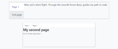
此处显示了这两个示例:
寻呼机
地点
@web/core/pager/pager
描述
Pager 是一个处理分页的小组件。页面由 offset 和 limit (页面大小)定义。它显示当前页面和 total 元素数,例如“9-12 / 20”。在前面的示例中,offset 为 8,limit 为 4,total 为 20。它有两个按钮(“上一页”和“下一页”)用于在页面之间导航。
注解
寻呼机可以在任何地方使用,但其主要用途是在控制面板中。请参阅 usePager 挂钩以操作控制面板的寻呼机。
<Pager offset="0" limit="80" total="50" onUpdate="doSomething" />
道具
姓名 |
类型 |
描述 |
|---|---|---|
|
|
页面第一个元素的索引。它以 0 开头,但寻呼机显示 |
|
|
页面的大小。 |
|
|
页面可以到达的元素总数。 |
|
|
当页面被寻呼机修改时调用的函数。该函数可以是异步的,执行该函数时无法编辑寻呼机。 |
|
|
允许单击当前页面进行编辑(默认为`true`)。 |
|
|
在上一页按钮上绑定访问键`p`,在下一页按钮上绑定`n`(默认为`true`)。 |
地点
@web/core/select_menu/select_menu
描述
当您想要执行除使用本机 select 元素之外的操作时,可以使用此组件。您可以定义自己的选项模板,允许在选项之间进行搜索,或将它们分组到小节中。
注解
更喜欢原生 HTML select 元素,因为它默认提供辅助功能,并且在移动设备上具有更好的用户界面。该组件旨在用于更复杂的用例,以克服本机元素的限制。
道具
姓名 |
类型 |
描述 |
|---|---|---|
|
|
选修的。要在下拉列表中显示的 |
|
|
选修的。在 SelectMenu 组件的根上设置的类名。 |
|
|
选修的。 |
|
|
选修的。启用多项选择。启用多重选择后,所选值在 SelectMenu 输入中显示为 tag。 |
|
|
选修的。类名在切换按钮上设置。 |
|
|
选修的。是否可以取消选择选定的值。 |
|
|
选修的。搜索框在下拉列表中是否可见。 |
|
|
选修的。显示为搜索框占位符的文本。 |
|
|
选修的。当前选择的值。它可以来自任何类型。 |
|
|
选修的。选择选项时执行的回调。 |
choice 的形状如下:
value是选择的实际值。它通常是技术字符串,但可以来自any类型。
label是与选项关联的显示文本。这通常是一个更友好且经过翻译的string。
group 的形状如下:
choices是要为此组显示的choice的列表。
label是与该组关联的显示文本。这是显示在组顶部的string。
Example
在以下示例中,SelectMenu 将显示四个选项。其中一个显示在选项顶部,因为没有任何组与其关联,但其他组则由其组的标签分隔。
import { Component, xml } from "@odoo/owl";
import { SelectMenu } from "@web/core/select_menu/select_menu";

class MyComponent extends Component {
  static template = xml`
    <SelectMenu
      choices="choices"
      groups="groups"
      value="'value_2'"
    />
  `;

  get choices() {
    return [
        {
          value: "value_1",
          label: "First value"
        }
    ]
  }
  get groups() {
    return [
      {
          label: "Group A",
          choices: [
              {
                value: "value_2",
                label: "Second value"
              },
              {
                value: "value_3",
                label: "Third value"
              }
          ]
      },
      {
          label: "Group B",
          choices: [
              {
                value: "value_4",
                label: "Fourth value"
              }
          ]
      }
    ]
  }
}
您还可以使用适当的组件 slot 自定义切换器的外观并为选项设置自定义模板。
<SelectMenu
  choices="choices"
  groups="groups"
  value="'value_2'"
>
  Make a choice!
  <t t-set-slot="choice" t-slot-scope="choice">
    <span class="coolClass" t-esc="'👉 ' + choice.data.label + ' 👈'" />
  </t>
</SelectMenu>
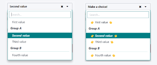
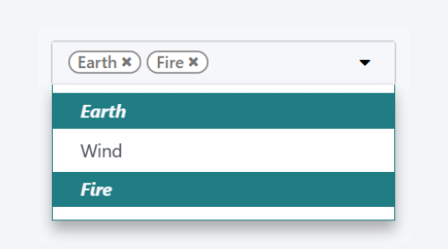
当 SelectMenu 与多项选择一起使用时, value 属性必须是包含所选选项值的 Array 。
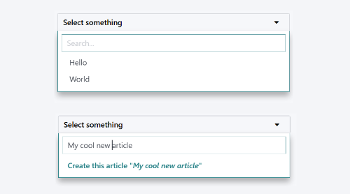
对于更高级的用例,您可以使用 bottomArea 插槽自定义下拉列表的底部区域。在这里,我们选择显示一个按钮,并在搜索输入中设置相应的值。
<SelectMenu
    choices="choices"
>
    <span class="select_menu_test">Select something</span>
    <t t-set-slot="bottomArea" t-slot-scope="select">
        <div t-if="select.data.searchValue">
            <button class="btn text-primary" t-on-click="() => this.onCreate(select.data.searchValue)">
                Create this article "<i t-esc="select.data.searchValue" />"
            </button>
        </div>
    </t>
</SelectMenu>
地点
@web/core/tags_list/tags_list
描述
该组件可以显示圆形药丸中的标签列表。这些标签可以简单地列出一些值,也可以是可编辑的,允许删除项目。可以使用 itemsVisible 属性限制显示项目的数量。如果列表长于此限制,则附加项目的数量会显示在最后一个标签旁边的圆圈中。
道具
姓名 |
类型 |
描述 |
|---|---|---|
|
|
选修的。标签是否显示为徽章。 |
|
|
选修的。标签是否显示文字。 |
|
|
选修的。列表中可见标签的限制。 |
|
|
提供给组件的 |
tag 的形状如下:
colorIndex是可选的颜色 ID。
icon是一个可选图标,显示在显示的文本之前。
id是标签的唯一标识符。
img是一个可选图像,显示在圆圈中,位于显示文本之前。
onClick是可以赋予元素的可选回调。这允许父元素根据单击的标签处理任何功能。
onDelete是可以赋予元素的可选回调。这使得从标签列表中删除该项目成为可能,并且必须由父元素处理。
text是显示的与标签关联的string。
Example
在下一个示例中,TagsList 组件用于显示多个标签。开发人员负责从父级处理按下标签或单击删除按钮时会发生的情况。
import { Component, xml } from "@odoo/owl";
import { TagsList } from "@web/core/tags_list/tags_list";

class Parent extends Component {
  static template = xml`<TagsList tags="tags" />`;
  static components = { TagsList };

  setup() {
    this.tags = [{
        id: "tag1",
        text: "Earth"
    }, {
        colorIndex: 1,
        id: "tag2",
        text: "Wind",
        onDelete: () => {...}
    }, {
        colorIndex: 2,
        id: "tag3",
        text: "Fire",
        onClick: () => {...},
        onDelete: () => {...}
    }];
  }
}
根据赋予每个标签的属性,它们的外观和行为会有所不同。
